Robin Winslow
on 17 January 2020
The second iteration of this year is the last one before our mid-cycle sprint next week.
Here’s a short summary of the work the squads in the Web & Design team completed in the last 2-week iteration.
Web, Ubuntu and Brand squad
Web is the squad that develop and maintain most of the brochure websites across Canonical and is the team that underpins our toolsets and architure of our projects. They maintain the CI and deployment of all websites we maintain. The Brand Squad are tasked with updating and managing the overall style of Canonical, Ubuntu and the many fantastic products we create both on and off-line.
New canonical.com website
Yesterday we released the new canonical.com website, which has been a few months in the making. The site is more succinct, consolidating the content into a single page, with clear, standout statements:

The largest piece of work was the new careers section, which provides a more interactive experience for discovering careers at Canonical:

Redesign of /download/server/thank-you
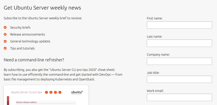
We’ve updated the thank-you page for downloading Ubuntu Server with a new form for signing up to our newsletter and also getting access to the CLI pro-tips 2020 cheatsheet.

451 Research: Kubernetes report
We’ve highlighted a new report from 451 Research on our homepage and with a dedicated page of its own.

MAAS
The MAAS squad develops the UI for the maas project.
The maas-ui team was focused on two main areas this iteration – fixing up UI bugs for the upcoming 2.7 release and completing the first part of the work on importing the main machine listing data into the React machine listing component. In addition to that we spent a significant amount of time preparing for the upcoming sprint in South Africa, ensuring we have all the specifications documents we need to discuss with engineers and have prepared a presentation to inform everyone of the work we’ve done so far this cycle.
JAAS
The JAAS squad develops the UI for the Charm Store and Juju GUI projects.
Controller view
The team worked on a first iteration of the Controller view for the new JAAS dashboard. This view is tailored for admin in particular, listing all the controllers that are under that group or user.

‘Group by’ functionality
The team implemented the functionality of grouping the model list table of the JAAS dashboard by status (default), owner and clouds and regions.

User testing
During our product sprint in South Africa we will be doing some user testing of the JAAS dashboard with internal users, before expanding the target group to customers and community users. The results will help us understand the prioritisation of the implementation and possible feature requests.
CharmHub POC
The Snapcraft team implemented the design of the detail page of the new CharmHub store exploring different front-end solutions in order to optimise the maintenance of the current Snap store on Snapcraft.io and the new CharmHub.io
UX and design explorations
The team explored different solutions on the graphs for the controller view of the JAAS dashboard, the side navigation and the table react component working with the MAAS team on the definition of the patterns.
Vanilla
The Vanilla squad design and maintain the design system and Vanilla framework library. They ensure a consistent style throughout web assets.
Multistage builds for docs.vanillaframework.io
We’ve been working on optimising our production builds recently. One of these optimisation is to use Docker’s build kit and multistage builds to both reduce image size and speed up subsequent builds.

This iteration we applied these enhancements to the build for docs.vanillaframework.io to improve the site’s release process.
Styling of the range input
Our existing Slider component was simply a styling on the HTML range input, so to keep consistency with the rest of native form inputs we removed the necessity of using p-slider class name. Any range input will now get Vanilla styling automatically.
This change will be live with the next version of Vanilla framework.
Encapsulating components
To make sure all of our components can be included and built independently from each other we started the work on encapsulating component styles, building them individually and making sure we have example pages for each individual component stylesheet.
This will allow us to make sure we don’t introduce any unnecessary dependencies between patterns in the future.
Snapcraft
The Snapcraft team work closely with the snap store team to develop and maintain the snap store website.
Integrating automated builds into snapcraft.io
We want to gradually import functionality from build.snapcraft.io to snapcraft.io. We have added authentication with GitHub and allowed the publisher the possibility of linking a GitHub repository with a Snap, this is done through a call to the Launchpad API.
Links to 3rd party app stores
We implemented buttons, on a number of three snaps details pages (VLC, Standard Notes & Plex Media Server), with links to Google Play Store and App Store to test if it would be useful to have these buttons on the details page of all snaps.


